Recognition
2009 AIGA Medal
Born
1926, Holliday, Texas
Deceased
2011, Sherman Oaks, California
By Marian Bantjes
September 20, 2009
Follow Us
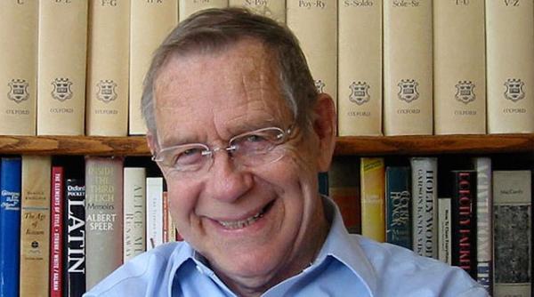
Students generally have very little idea of the world they are entering into, and their teachers—like parents—are viewed as beings who alternately guide and admonish; rarely are those teachers viewed as individuals or is their professional standing considered. It is usually only afterward, when young people encounter real-life situations in their chosen professions that they sometimes learn (if they are lucky) that they studied with one of the greats. Those fortunate enough to have studied with Doyald Young at Art Center College of Design, in any of the years since he started teaching lettering and logotype design (from 1955–1978, followed by 1997–present), are likely to develop a gradual, yet profound appreciation for the rarity and importance of that experience.
An education with Doyald Young would be to learn from one of the most precise hands and knowledgeable eyes of our time. His understanding of the form of the letter, the arc of the curve and the subtleties of logotypes, is unsurpassed in North America. There are few that Young would defer to internationally, with the notable exception of his friend Hermann Zapf.
Born in Holliday, Texas in 1926, Young has had many years to practice, despite taking a somewhat circuitous route to the area of his expertise. After leaving home at age 15, he worked as a bellhop, an usher and a railroad brakeman; he dismantled junk cars in his father's wrecking yard and took on an astonishing variety of other unskilled jobs in the biggest U.S. cities and “jerk-water towns” from East to West and North to South. In 1946, at age 19, he settled in Los Angeles, where he continued his odyssey of manual labor. Young's “first encounter with a square-tipped rigger brush” came while writing point-of-purchase show cards for W. T. Grant's five-and-dime store. Some silkscreening followed, and after another string of odd jobs, he enrolled in evening classes at Frank Wiggins Trade School.
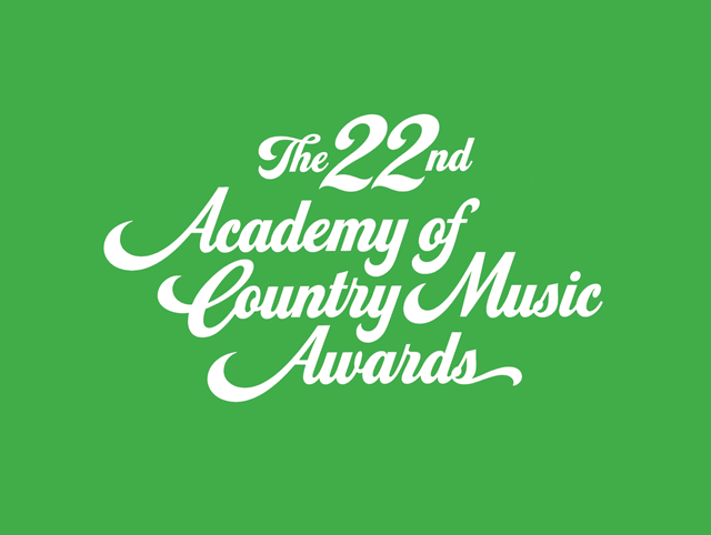
Logotype for the 22nd Academy of Country Music Awards, 1987.Client: Robert Keene, production design, Dick Clark Productions.
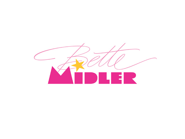
Logotype for Bette Midler benefit performance at Universal Amphitheatre, 2002.Client: Caroline Labiner Moser, trustee, Children’s Museum of Los Angeles.

Logotype for the 30th Annual Grammy Awards, 1988.Client: Robert Keene, production design, Pierre Cossete Productions.
It was in 1948 at Frank Wiggins that Young's formal training began, when he was taught by Joe Gibby to draw and ink letters with a brush, and to really see the letterform. A more rigorous training and attention to detail came from Mortimer Leach at Art Center during the 1950s. The string of jobs continued but now he would rely on his hands rather than his back, and in 1955 Young started to teach at Art Center—first as Leach's assistant, and then on his own—as well as begin the freelance work he continues to this day. Young credits his long-term business relationships with designer Mary Sheridan and industrial designer Henry Dreyfuss with his further education in “taste, psychology, practicality, formality, design, client relations, presentations, and understated prestige.”
Taste. Practicality. Formality. Understated prestige. The combination of those qualities forms as perfect a descriptor of Young's work as any you are likely to find, both in the process and the result. Although he is widely known for his elegant curves and scripts, he has never been a showy designer—there's not a trace of ego in his work. The range of letterforms able to flow at any time from his hand is great, and there is no way to particularly define Young's mark unless you have seen the hand-drawn comp. That is where his work is unmistakable: perfect letterforms drawn in pencil at a surprisingly small size without so much as a mark of hesitation or awkwardness. The style varies but the fluidity and perfection do not.
To the contemporary designer, who begins the process of creating a logotype by trying out multiple variations of any of the hundreds (or thousands) of fonts available on their computer, Young's technique is both astonishing and daunting. It is unfathomable how much time and energy his approach would take, but such is Young's mastery that it takes him only a minute or two to produce each iteration for a comp—beyond any doubt, far less time than it takes the average designer to hunt for and fiddle with various fonts.
Furthermore, his results are infinitely more interesting, as he is able to quickly recognize and exploit the opportunities for joined or nested letters, interesting intersections, angles, shapes and weight changes within the logotype. He may produce 40 to 100 roughs in a few days in a variety of lettering styles, each one unique from the next.
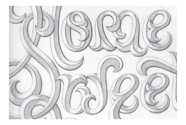
Home Sweet Home (detail), personal work, 1966.

Logotype for John Deere, 1972.Client: Tim O’Connor, manager, corporate design and graphics, Deere & Company; Henry Dreyfuss.
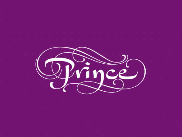
Logotype for Prince, The Hits collection, 2000.Client: Jeri Heiden, creative director, and Greg Ross, art director, Warner Bros. Records.

Company, brand names and proprietary font for Prudential Financial, 1997.Client: John March, director, corporate identity, The Prudential Insurance Company of America.
Then, lest you imagine an antiquated codger stuck in time with pencil and paper, Young, upon approval of the final logotype, will create a precise copy in vector outlines with every curve and detail perfectly rendered and adjusted for use in print. He has, in fact, been working on the computer since 1988 and using digital applications for his artwork since 1993. He has also created complete fonts from scratch, which, to those who know the trials and tedium of kerning and hinting, is no mean task. While adept at the computer, he remains adamant in promoting drawing for the start and development of the letterforms.
Young's typographic skills have benefited a company list as extensive as it is impressive. It includes logotypes for hotels, clubs, universities, cosmetics, financials, arts and practically every other industry, and includes many of the biggest names: Hilton, Prudential, Max Factor, Sony. His letters have also adorned many of the most well-known awards shows in the entertainment industry (the Grammys, Golden Globe, the Tonys) and a veritable grandstand of celebrities, including Elvis Presley, Liza Minnelli, Frank Sinatra, Bette Midler and Prince.
Young has created several corporate fonts, but in 1985 he released his first commercially available fonts: Young Baroque, an elegant script, followed by Eclat, a fat-face script, both developed by Letraset. More recently he developed and released Home Run and Home Run Sanscript (2002–2003), which bear a resemblance to Eclat, but are more condensed and refined, and have the feel of the show card in them, as well as Young Finesse (2003), a breezy, innocent “serifless roman,” and its accompanying italic (2006).
He has written, designed and published three books about his work: Logotypes & Letterforms (1993), Fonts & Logos (1999) and Dangerous Curves (2008). He has also created a promotional book of his work, The Art of the Letter (2003), for SMART Papers. While all his books have been critically acclaimed, Fonts & Logos is considered indispensable by font designers, educators and typographers.
He was named Inaugural Master of the School by Art Center College of Design in 2001, named a Fellow of the Los Angeles chapter of AIGA in 2006, and has lectured extensively throughout the world.
So how do you get to be one of the greats of graphic design? If Doyald Young is the example, start with a well-rounded education in life, study with the masters, pay homage to your mentors, work hard, work long and, like the old joke about how to get to Carnegie Hall (for which he has also designed), practice, man, practice.
Resources