Recognition
2010 AIGA Medal
Born
1942, Seattle, Washington
By Peter Hall
September 18, 2010
Follow Us
Recognized for establishing the highest standards of corporate design through his work shaping the visual identity and sensibility of American design innovation company Herman Miller for more than 40 years.
Steve Frykholm’s design career at Herman Miller began with a large ear of sweet corn—a curiously appropriate symbol, its rows of kernels forming an orderly grid and its roots originating in the watery, agrarian landscape of Western Michigan. Soon after arriving at the Zeeland-based furniture manufacturer, in 1970, Frykholm was asked to design a poster for the company picnic, named the Sweet Corn Festival. “I said I’d take a crack at it,” he recalls. Working with designer Phil Mitchell, Frykholm came up with a 29“ x 39” screen print of a pair of teeth clamped around an ear of corn, printed Pop Art-style in high-gloss inks. Part of the impulse also came from muscle memory: “I had learned to screen print while in the Peace Corps teaching at a trade school for girls in Nigeria,” says Frykholm. The combination proved fruitful. Frykholm went on to design 20 picnic posters in the subsequent 20 years, several of which ended up in the permanent collection held at the Museum of Modern Art.
Having now worked for Herman Miller through four decades, several economic downturns, and six different CEOs, Frykholm has acquired a juicy body of work, some considerable experience, and some of the blunt Calvinist demeanor of his progressive but no-nonsense employer. Like the Walker Art Center in Minneapolis and Apple Computer in Cupertino, Herman Miller in Zeeland is one of those few U.S. design-driven firms with an unusually high commitment to visual coherence and research and development. An unabashed Modernist zeal runs through Herman Miller’s communications, from its general corporate guidelines to remain “human, spirited, and purposeful” to the clean but personable lines of Meta, the Erik Spiekermann-designed typeface that Frykholm introduced as the house face in 1999. (Meta replaced uber-Modernist Helvetica, which had been the corporate typeface for 30 years.)
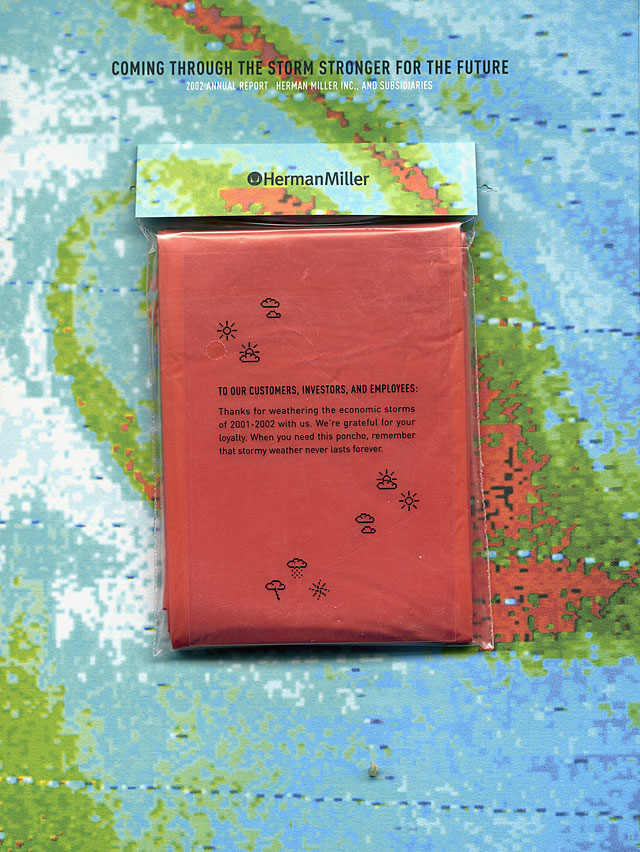
Herman Miller annual report, 2002 Client: Herman Miller; Creative director: Steve Frykholm: Designer: Brian Edlefson.
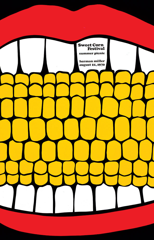
Sweet Corn, Herman Miller Picnic poster, 1970 Client: Herman Miller; Designers: Steve Frykholm, Phil Mitchell; Illustrator: Steve Frykholm, Phil Mitchell.
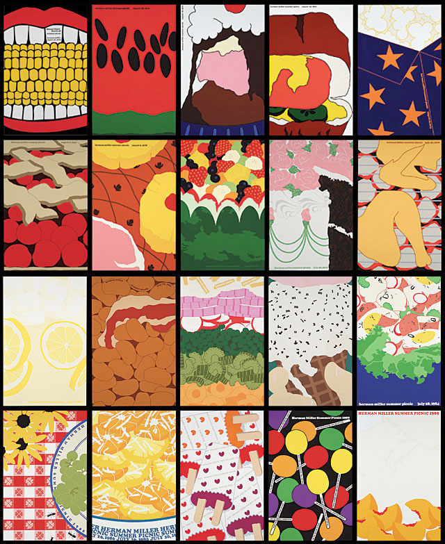
Composite: 20 Herman Miller Picnic posters, 1970–1989 Client: Herman Miller; Designers/Illustrators 1970–1971: Steve Frykholm, Phil Mitchell; Designer/Illustrator 1972–1989: Steve Frykholm.
Frykholm was, for a time, best known for his tireless reinvention of the annual report, which, in addition to receiving stacks of design awards, frequently earned the honor of being shamelessly copied. “He tries to do something different or unique to him every time,” says Yang Kim, who worked on 10 Herman Miller annual reports with Frykholm. She adds, “He has a lot of integrity about trying to come up with something new, and these days it’s a lot easier to come up with something familiar.” Among the best-known examples were the 1993 report—based on the theme of customer correspondence and festooned with Post-it notes, as well as reproductions of postcards and letters received from the public—and the 2002 report, published after a terrible fiscal year, which featured a Doppler radar scan of inclement weather and an emergency rain poncho attached to the cover. However, the most imitated was probably the 1985 report published after Herman Miller’s then-CEO Max De Pree introduced profit sharing. Titled “Say Hello to the Owners,” the report featured a full-height photograph of each of the company’s employees, along with quotes responding to questions of why they liked working for Herman Miller and what employee ownership meant to them. “There were 3,000 employees and we integrated all of them, regardless of title or position, in 13 spreads including the covers,” Frykholm says.
The people-centered emphasis of the organization is also substantiated in the fact that Herman Miller has led all furniture companies in Fortune magazine's “World’s Most Admired Companies” survey in 23 of the last 25 years, and has frequently been included among the “100 Best Companies to Work For” in America. Frykholm straddled the company’s transition from a small, family-owned business with a reputation for innovation and experimental design, to an international business with annual revenues of $1.3 billion.
When Frykholm arrived in Zeeland with an MFA from Cranbrook Academy of Art, Herman Miller’s founder DJ De Pree and designers Charles and Ray Eames were still actively involved in the company, with De Pree’s sons running the firm. As Frykholm assumed more responsibility, Herman Miller grew in stature and size, known not only for high-end classics of the Eames, Alexander Girard and George Nelson era, but for ubiquitous symbols of the corporate office interior. Icons emerged in Frykholm’s print work, for good and bad: The Action Office system developed by Robert Propst for Herman Miller in the late 1960s was a key part the company’s growth, even as it mutated through imitation into the much-maligned cubicle farm. The phenomenally successful Aeron chair, initiated and developed by Bill Stumpf and Don Chadwick in the 1990s, also gained a certain notoriety after the dot-com crash. A particularly memorable image from Herman Miller’s “Good Stuff” brochure of its sales inventory showed a businessman sitting in an Aeron chair on the sidewalk amid the maelstrom of Times Square. Chair too comfortable to leave in the office? A symbol of the company without walls? For Stumpf, it also became an image of the chair’s negative associations, says Frykholm: “When Enron went belly up and we saw photos of employees leaving with their boxes on Aeron chairs, Bill said, ‘Oh no! The chair’s become a symbol of corruption.’”
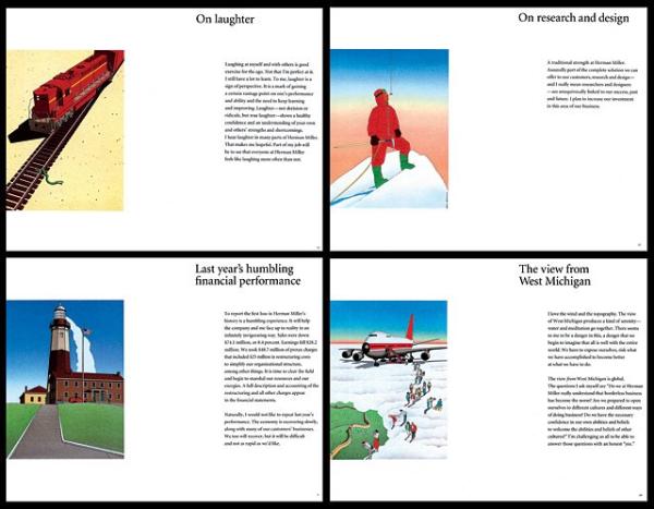
Herman Miller annual report, 1992Client: Herman Miller; Designers: Steve Frykholm, Yang Kim; Illustrator: Guy Billout.
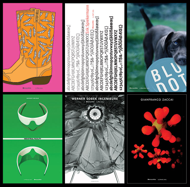
Design Now posters, six from a series of 24, 2003–2007Top row from left: Peter Bell, 2005; Erik Spiekermann, 2005; Blue Dot, 2004Bottom row from left: Industrial Facility, 2006; Werner Sobek Ingenieure, 2004; Gianfranco Zaccai, 2005Client: Herman Miller; Creative director: Steve Frykholm; Designers: Steve Frykholm, Martin Burch, Andy Dull.
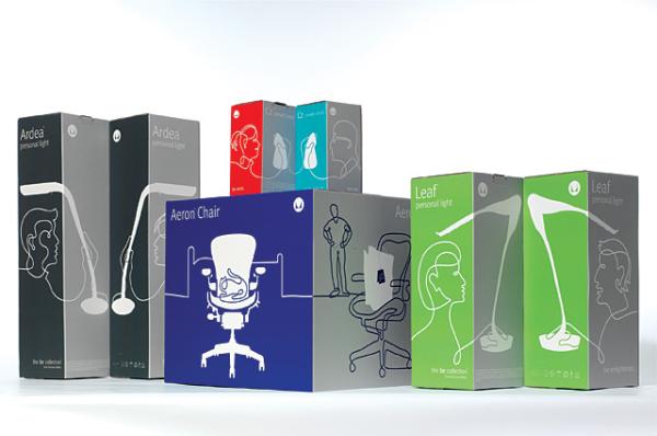
Be Collection packaging, 2007 Client: Herman Miller; Design firm: Fairly Painless Advertising: Creative directors: Peter Bell, Steve Frykholm; Designer: Rick VanderLeek; Illustrator: Felix Sockwell.
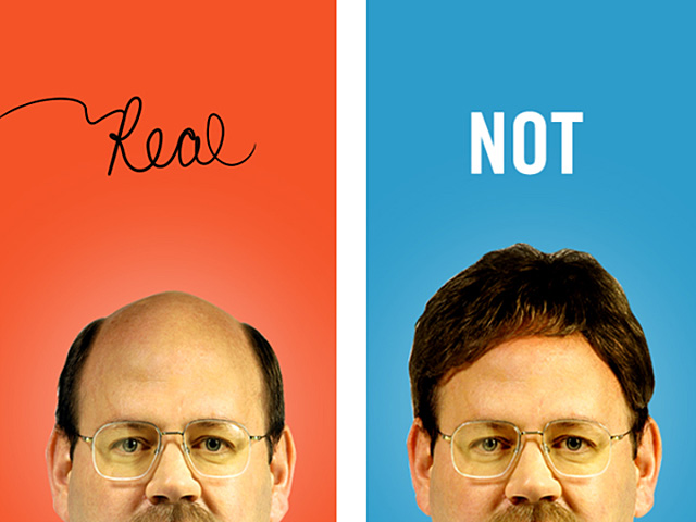
Still from Herman Miller “Get Real” video, 2003 Client: Herman Miller; Design firms: Fairly Painless Advertising, Imaginary Forces: Creative directors: Peter Bell, Karin Fong, Steve Frykholm; Art director: Julie Lang; Designers: Karin Fong, Julie Lang: Producers: Karin Fong, Grant Lau.
Many of the memorable images developed under Frykholm’s direction in the 1970s emerged out of a taste for the unexpected and impulsive. A particularly architectonic collection of Fritz Haller furniture was taken out to a celery field and arranged amid the orderly rows. “I just decided it would be fun. We bought the farmer’s produce before the shoot because we knew we’d probably ruin it,” says Frykholm. In another shoot, Verner Panton’s famous plastic chair was driven to a snowstorm in North Michigan where Frykholm’s team photographed it on a frozen lake next to a fishing shanty. “No one challenged what we were doing,” recalls Frykholm, who by the mid-1980s had a large team of designers and writers reporting to him.
Today, Frykholm assumes a more advisory, less hands-on role, as the various divisions and subsidiaries of Herman Miller increasingly farm out their design work. The atmosphere is different, he says; even photographing a chair outside risks rejection by his colleagues in marketing and legal on the grounds that leaving a Herman Miller chair outside would void the warranty. “I do get a decent print job now and then,” he writes in a note, describing his role on one project as “advisor, catalyst, contributor, archivist, agitator.” He adds, “How does one talk about their contribution in a collaborative team effort? My fellow team members might add a few suggestions as to what I bring to the mix!”
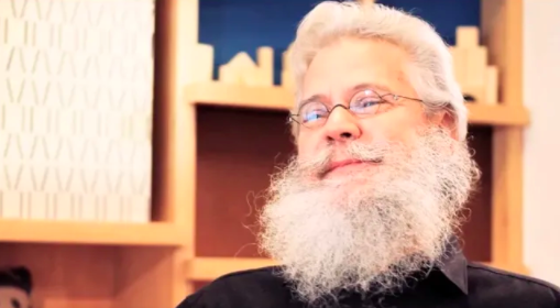
Several of the designers who have received commissions from Frykholm will mention two significant characteristics: first, his long, shaggy beard—a symbol as malleable as the Aeron, perhaps of a company man in denial, from a bygone age when creative folk were more inclined to wear their nonconformity on their chins. Second is the fact that Frykholm is a client who is first and foremost a designer. “He’s very good at entertaining all the ideas, whereas a marketing executive would be annoyed by that,” says Kim. Karin Fong, who produced a video for Frykholm and Fairly Painless Advertising, recalls Frykholm’s enthusiasm and playfulness. “He always encouraged our ideas—taking classic [Herman Miller] designs into animation was new territory. Perhaps someone with less trust in the design process would want to see more checkpoints and justifications, but Steve was enthusiastic from the very first storyboards.”
Ultimately, enlightened design management can only really emanate from organizations that embrace design to the core. One might contend that anyone in Steve Frykholm’s position, overseeing the visual identity of a company that prioritizes design, would do a good job. But Frykholm, now in his sixties, seems to relish the role of dissenter, not smoothing operations but stirring them up. “Working with Steve is not really about adhering to a rigid style guide,” says Fong. “Instead you feel the Herman Miller history at your back—not over your head.” Clark Malcolm, a long-time collaborator with Frykholm and a writer/editor at Herman Miller for more than 20 years, sums up his colleague as “one of the last survivors from the world of great graphic thinking in the 1970s and ’80s. For me, he epitomizes all that is magical and delightful in graphic design, from the process to the product. As someone once said about Charles Eames, when you’re around Steve Frykholm, he’s never teaching, but you’re always learning.”