2013 AIGA Medalist: Jonathan Hoefler and Tobias Frere-Jones
Recognition
2013 AIGA Medal
Born
1970, New York, New York (Jonathan Hoefler)
1970, New York, New York (Tobias Frere-Jones)
By Angela Riechers
September 9, 2013
Follow Us
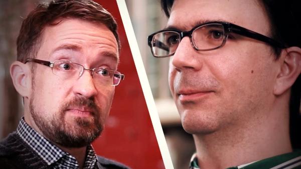
Type designers extraordinaire Jonathan Hoefler and Tobias Frere-Jones are recognized for their contributions to the typographic landscape through impeccable craftsmanship, skilled historical reference and insightful vernacular considerations.
Jonathan Hoefler and Tobias Frere-Jones are responsible for some of the digital era’s most well-designed and beautifully crafted typefaces. The type designers bring to their collaborative work a formidable knowledge of typographic history paired with an impeccable eye for combining, adapting and evolving traditional letterforms into entirely original type systems. As a duo, Hoefler and Frere-Jones have a singular ability to decode contemporary visual culture, translate it and express it in typefaces of considerable technical quality and emotional impact.
“There’s a cleanliness to their fonts. They’re always very precise and beautifully spaced,” says Heavy Meta principal Barbara Glauber, who has designed album covers for the rock band They Might Be Giants, among other projects, with Hoefler. “There’s nothing superficial in their work. Everything is very purposeful and systematic.”
Born just six days apart in New York during the same sweltering week in August 1970, Hoefler and Frere-Jones each took an interest in letterforms from an early age. As a child, Frere-Jones would puzzle over the Gill Sans lettering on jars of jam brought back from the UK by his English mother, wondering just what about the labels made them look so British. “It took me a while, but eventually I figured out it wasn’t the proportion of the jar or the colors—it was something about the letters,” he explains. “Years later, I figured out that thing had a name.”
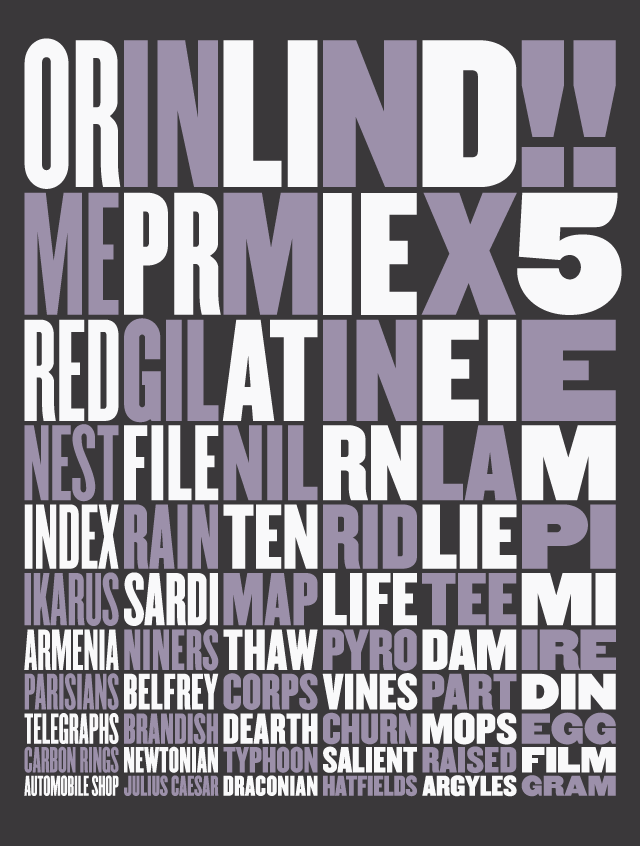
Champion Gothic digital typeface, 1991 Design firm: Hoefler & Frere-Jones.
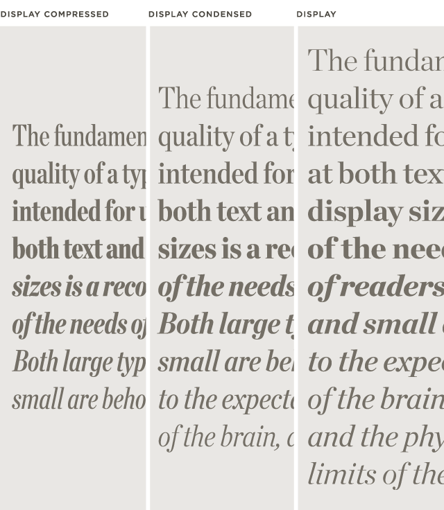
Chronicle Display digital typeface, 2002 Design firm: Hoefler & Frere-Jones.
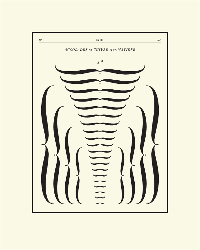
Didot digital typeface, 1991 Design firm: Hoefler & Frere-Jones.
One day at Saint Ann’s High School in Brooklyn, where he was a student, Frere-Jones received word from the office that the renowned typographer Ed Benguiat had called and left a message for him. At first, he thought it was a prank—until he realized his friends had no idea who Benguiat was, and would more likely have concocted a fake message from the rock band Van Halen instead. (Benguiat had seen the teenager’s submission to a design contest and wanted to invite him to attend his letterform design class at the School of Visual Arts, as Frere-Jones learned when he returned the call.) Frere-Jones went on to study graphic design at the Rhode Island School of Design before joining the Font Bureau in Boston. There, he designed some of the firm’s best-known fonts, including Poynter Oldstyle and Interstate, which have been used for everything from U.S. Census forms to Us Weekly magazine.
During his childhood, Hoefler was especially fascinated by codes and ciphers of all sorts—whether ship signal flags, semaphore or Morse code. “Discovering as an adolescent that typography was incredibly coded—that choice of typeface could tell you the genre of a movie before you read the title—was irresistible,” he says. “I really wanted to be part of that secret embedded in the design of the letters.”
Hoefler is largely self-taught; by the age of 19 he’d already worked with magazine art director Roger Black for about a year, before opening the Hoefler Type Foundry in 1989. He quickly received acclaim for his work, including Knockout and Hoefler Text, which is part of the operating system for Mac computers as well as the iPad. I.D. magazine named him one of the 40 most influential designers in America for his original typefaces designed for magazines such as Harper’s Bazaar and Rolling Stone, and for institutional clients such as the Guggenheim Museum.
Hoefler and Frere-Jones’s independent careers ran on parallel tracks during the 1990s. In the then-small world of type designers, they frequently competed for projects and often bid against each other for rare type specimens at antiquarian book fairs. They maintained a friendly relationship at a distance, however, sharing advice and consulting each other by email and fax, but it became increasingly hard to ignore the potential advantages to be gained by combining their efforts (and their type specimen libraries). In 1999, Frere-Jones joined Hoefler’s studio as a principal, and the partnership that would become Hoefler & Frere-Jones (H&FJ) was born. Since then, their collaboratively designed original typefaces have been commissioned by clients such as Martha Stewart Living, Nike, Pentagram, the New York Times and the New York Times Magazine. As of early 2013, H&FJ is a 19-person design practice.
When the pair is developing a new typeface, they look to the historical record not for models to imitate, but in search of unfinished ideas that invite new solutions. Frere-Jones calls this an “atomized” approach to history, freely applying the strategies of different typographic traditions to the project at hand. “They are both first-rate designers,” notes fellow typographer and 1995 AIGA Medalist Matthew Carter, whose distinguished body of work has involved type-making technologies from punchcutting to RoboFont. “I don’t think their typefaces share an absolutely consistent aesthetic, but the same good design eyes and the same historical background are present in everything they do—which is not to say their work is backwards-looking. It’s firmly grounded in the typographical tradition, in the continuum.”
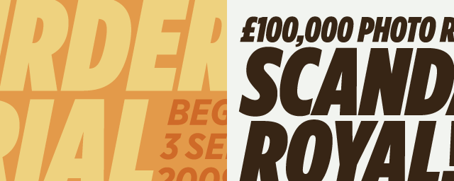
Gotham digital typeface, 2000 Design firm: Hoefler & Frere-Jones.
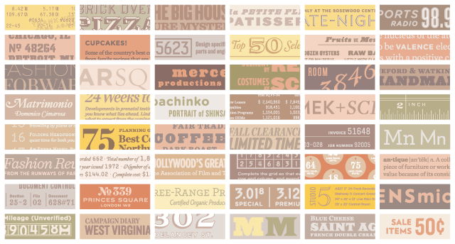
H&FJ; Catalog artwork: digital typefaces, 2009 Design firm: Hoefler & Frere-Jones.
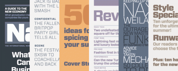
Forza digital typeface, 2010 Design firm: Hoefler & Frere-Jones.
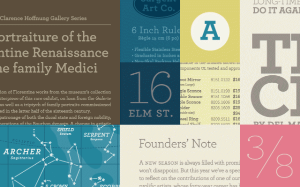
Archer digital typeface, 2002 Design firm: Hoefler & Frere-Jones.
Intense research plays a part in their process, with every aspect of every letter in a font thoughtfully considered. Nothing is randomized; nothing is left to chance. In the mid-1990s, Hoefler became an early adopter of Python, a new programming language that was making inroads in type design. Much of this period was spent developing tools to automate repetitive tasks such as kerning, the practice of managing the space between awkward pairs of letters. Rather than step through the alphabet from Aa to Zz, one of Hoefler’s tools allowed designers to move through entire regions of the alphabet at once, reviewing at a glance all diagonal or round shapes. An equal footing in technology and language ensured that every combination was considered visually, even rare ones such as Yq (as in Château d’Yquem).
To design Retina, for the Wall Street Journal’s stock listings, Hoefler and Frere-Jones first analyzed more than 120 national and international newspapers and gathered 3,800 reference examples of ways in which news agate type is used. A typeface meant to be used at extremely small sizes (five point and below), Retina incorporates specific features to maximize legibility in the unforgiving print environment of small type on low-quality newsprint: ink traps prevent pooling where strokes intersect, larger counters within letters provide more white space and the disambiguation of forms ensures that a capital letter “B” and a number “8”, for instance, look as dissimilar as possible. The logical, systemic thinking behind Retina landed it a spot in the Museum of Modern Art’s permanent collection—along with the Gotham, HTF Didot and Mercury type families—in 2011. The designers’ work is in the collections of the Victoria and Albert Museum and the Cooper-Hewitt, National Design Museum, as well.
H&FJ’s Gotham, introduced in 2000, is one of the most successful typefaces designed within the last 20 years. Originally commissioned for use in GQ magazine, it is a marvelously adaptable font now seen everywhere, from the granite cornerstone of the Freedom Tower at the site of the World Trade Center to graphic material for the 2008 Obama campaign. Gotham was directly inspired by New York City building signage. “I’d long had my eye on a particular strain of vernacular lettering that was captured especially well by the sign on the Port Authority Bus Terminal on Eighth Avenue,” Hoefler explains. “Type designers guard their secrets closely, but this one had been hard not to share with Tobias: I knew he’d dig it, and instantly see its potential as the foundation for a family of typefaces. It was one of the first things I pointed out when we began collaborating in 1999, and I don’t think the week was out before Tobias began sketching a prototype for the typeface that would become Gotham Bold.”
To investigate this nameless and unrecognized style, Frere-Jones photographed thousands of examples of public lettering in Manhattan, from storefronts and office buildings to faded advertisements and signage on oil trucks. Over the development of the project, Hoefler served as editor, helping to articulate some of the emerging themes in the letterforms to define and establish the design’s strengths and weaknesses. It’s a pattern Hoefler and Frere-Jones have followed ever since—one acts as author, the other as editor, each proposing ideas he thinks the other will love, working in tandem to get to the heart of the project and then reviewing every drawing together until the design is complete. Gotham has earned a high degree of visibility within pop culture; H&FJ regularly receives emails from designers that show its use in the frosted lettering on tea cakes, or rendered in materials ranging from burnt toast to embroidery.
Hoefler and Frere-Jones lecture widely, and both are respected teachers. In the words of Pentagram partner Michael Bierut, they are known for being “great explainers,” able to communicate minutely detailed information with grace and efficiency to students, clients and colleagues alike. Hoefler has been a visiting critic at Yale University, Cooper Union and the School of Visual Arts. Frere-Jones has taught type design at the Yale School of Art’s graduate program since 1996, and in 2006 became the first American awarded the prestigious Gerrit Noordzij Prize, presented by the Royal Academy of Art in The Hague, for his contributions to type design and type education. The Association Typographique Internationale (ATypI) awarded Hoefler its most prestigious prize, the Prix Charles Peignot, in 2002 for outstanding contributions to type design.
Of all the creative disciplines, type design is perhaps most heavily dependent on evolving technology, not only in terms of the development of the letterforms themselves, but in the very environments in which they will be put to use. “We try to keep ourselves flexible enough to take the lessons of a 16th-century punchcutter and apply them to what will happen on Internet Explorer running on Windows 8,” says Frere-Jones. This is evident in a project that has consumed a great deal of their time over the last three years: the adaptation of their entire library of more than 700 fonts to suit the screen, and the creation of more than 200 new fonts specifically designed for digital environments, from smartphones to computer screens to stadium-sized Jumbotrons. It’s a daunting feat both in scope and ambition, but these are designers who clearly relish a challenge.
As Hoefler sees it, “We are at a point in history where we can ask: what kinds of semantic distinctions do online readers need, what kind of distinctions do authors benefit from and how can typography address this? That opportunity hasn’t come up in two or three centuries.”
Frere-Jones adds, “Here, the intersection of technology and culture and emotion and commerce are all on the table at once.”