Recognition
2013 AIGA Medal
Born
1962, Bregenz, Austria
By Steven Heller
September 2, 2013
Follow Us
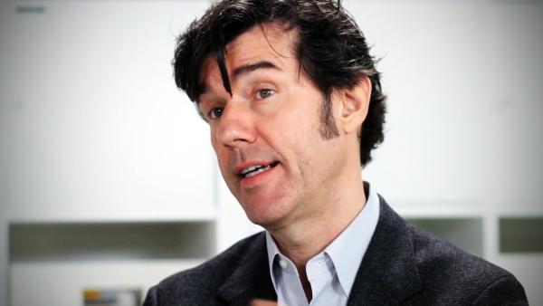
Inspirational and intriguing designer Stefan Sagmeister is recognized for his unorthodox, provocative designs that tweak the status quo and question the designer’s role in society.
A cunning trickster turns convention upside down, stretches the bounds of propriety, stomps on mores and taboos and alters popular perceptions. Stefan Sagmeister has long fit this “bad boy? bill. Known for upsetting norms, he tricks the senses through design, typography, environmental art, conceptual exhibitions and, lately, video.
Long ago, Sagmeister, whose motto was “Style=Fart,? replaced style with attitude. His designs are rooted in disorienting images and self-defining aphorisms. With apparent ease, Sagmeister morphs—as tricksters are wont to do—taking on various skins, from graphic designer to conceptual typographer to performance artist. When the mood strikes, he returns to being a designer, and a completely new cycle of transformation commences.
For an AIGA lecture in 1999, he famously had the lettering for the event poster carved into his naked body; for his 2003 “Sagmeister on a binge? exhibition poster, he ate 100 different junk foods, gaining more than 25 pounds, and took “before? and “after? photographs of his semi-nude body. For a short typographic film, he dangled precariously out of an upper-story window of the Empire State Building as police scrambled with nets below. The list goes on.
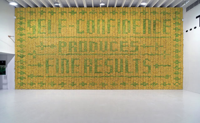
Banana Wall, 2008 Client: Deitch Projects; Design firm: Sagmeister, Inc.; Art director: Stefan Sagmeister; Designers: Joe Shouldice, Richard The.
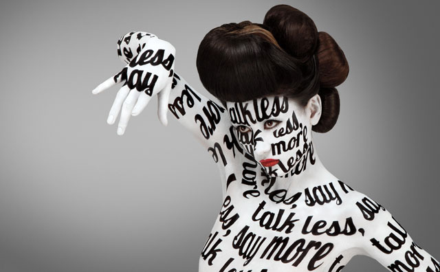
Aizone FW11 Campaign, 2011 Client: Aizone; Design firm: Sagmeister & Walsh; Creative director: Stefan Sagmeister; Art director and designer: Jessica Walsh; Photographer: Henry Hargreaves; Body painter: Anastasia Durasova; Creative retoucher: Eric Jonasson; Hair Stylist: Gregory Alan.
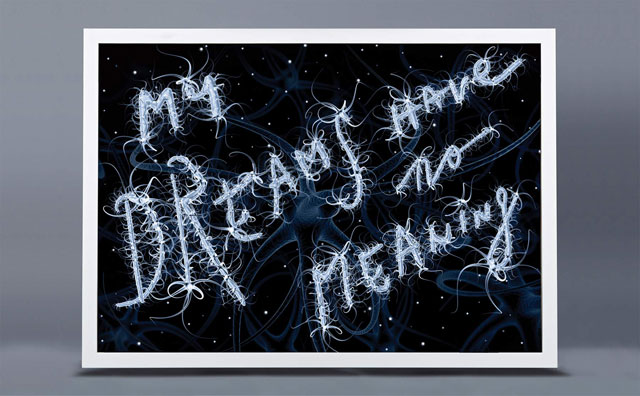
My Dreams Have No Meaning, 2008 Client: Sagmeister Inc.; Art director: Stefan Sagmeister; Designers: Gui Borchert, Joe Shouldice.
Born in Bregenz, Austria in 1962, Sagmeister began his unorthodox career at age 15 writing for Alphorn, a small, left-wing magazine, but quickly realized that working on the layout was more enjoyable than writing articles. He earned an M.F.A. at the University of Applied Arts in Vienna in 1985, and received a Fulbright scholarship to study at Pratt Institute in New York. Even as a young designer he was peripatetic: he took a position with the Leo Burnett Hong Kong Design Group in 1991. Surprisingly, the job did not trigger his atavistic rebellion, but it did give him a taste for other worlds.
During his student days in New York, Sagmeister had courted another design bad boy, Tibor Kalman, of M&Co. “Tibor Kalman was the single most influential person in my design-y life and my one and only design hero,” Sagmeister told me. “Twenty-five years ago, as a student in NYC, I called him every week for half a year, and I got to know the M&Co receptionist really well. When he finally agreed to see me, it turned out I had a sketch in my portfolio rather similar in concept and execution to an idea M&Co was just working on. He rushed to show me the prototype out of fear I’d later say he stole it out of my portfolio. I was so flattered.”
When M&Co eventually hired Sagmeister five years later, in 1993, Sagmeister discovered that Kalman had an uncanny knack for giving wisdom-laced advice, which had a deep influence on him as he began cultivating his own career. Perhaps most importantly, Kalman encouraged Sagmeister’s own creative restlessness: “Tibor was always happy and ready to jump from one field to another: corporate design, products, city planning, music videos, documentary movies, children’s books and magazine editing were all treated under the mantra, ‘You should do everything twice. The first time you don’t know what you’re doing. The second time you do. The third time it’s boring,’” Sagmeister said.
After M&Co abruptly disbanded, when Kalman moved to Rome to edit Benetton’s COLORS magazine, Sagmeister began to specialize in CD cover design. “I get a bigger kick out of meeting some of my musical heroes than sitting in meetings with a marketing director, which I did a lot before I opened my own specialized studio,” he explained in an interview with me a dozen years ago.
I.D. magazine, which in the late ’90s was Sagmeister’s most avid promoter, wrote that his “CD package designs are what poetry is to prose: distilled, intense, cunning, evocative and utterly complete. His intentions have set a new standard.” Designing for his musical heroes—Mick Jagger, Lou Reed, David Byrne and Jay-Z among them—enabled Sagmeister to create unique artworks based on the artists’ personas. He used printing and packaging tricks that involved laser-cuts, die-cuts, model building and more, but the witty, elegant and eclectic concepts were the engine that drove the outcome, and he received two Grammy Awards for his designs.
During the early 2000s Sagmeister was totally invested in this genre and medium. In an interview, I asked him if he wanted to continue with this specialty or enter general practice. He responded in the affirmative without hesitation. I asked if he saw graphic design as a viable practice for future generations: “I personally believe that print is going to be around for a very, very long time,” he replied. “If I’m wrong, future designers will have to be screen-based….I’d rather move to Sri Lanka and build a house than become a website designer.”
But Sagmeister encountered a different vision of the future while on a trip to Seoul, South Korea, in 2003: the MP3 on handheld devices. After returning to New York, he substituted the record-packaging class he taught for the Designer as Author M.F.A. program at the School of Visual Arts with another course, reasoning that in two years or less the CD would be irrelevant—and so would its design.
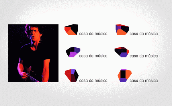
Casa da Musica identity, 2007 Client: Casa da Musica, Portugal; Art director: Stefan Sagmeister; Designers: Matthias Ernstberger, Ralph Ammer, Quentin Walesch.

Lou Reed poster, 1996 Client: Warner Bros. Records Inc.; Design firm: Sagmeister Inc.; Art director and designer: Stefan Sagmeister; Photographer: Timothy Greenfield-Sanders; Copywriter: Lou Reed.

F-Stop, 2002 Client and publisher: FontShop International; Art director: Stefan Sagmeister; Designer and illustrator: Matthias Ernstberger.

Oubey Mindkiss, 2009 Client and publishers: Deutscher Kunstverlagt; Design firm: Sagmeister Inc.; Art director, concept: Stefan Sagmeister; Concept: Dagmar Woyde-Koehler; Designer: Roy Rub, Seth Labenz; Production: Laurence Ng.
It was time for Sagmeister to reinvent his practice. In 2008, taking on other types of corporate and media work would have been axiomatic and fruitful, but instead, his next move was an unprecedented act of personal chutzpah: he announced a one-year sabbatical from all commercial work, and retreated to Bali.
Was Sagmeister nuts? Would clients who relied on him remain loyal? Was this a trickster’s trick? True to form, he took the leap not knowing what the consequences might be. In return, he experienced one of those precious “aha” moments. It was during this sabbatical when, after deciding against learning how to direct film out of fear “I might devote a lot of time learning this new language and wind up having nothing to say,” he recalled, “it occurred to me I should try to stick with the language I do know how to talk, design, and see if I’d have something to say in it.”
Thus was born Sagmeister’s text-based artwork, which fits nicely alongside the work of artists like Lawrence Weiner and Jenny Holzer, who use aphorisms and text fragments to express, either through poetic nuance or commanding declaratives, ideas designed to foster individual thought and group action. Sagmeister included a personal touch, building letterforms that both spell out and illustrate maxims pulled from his own diary: “Worrying solves nothing,” “Low expectations are a good strategy” and “Trying to look good limits my life.” Some were published in his second monograph, Things I have learned in my life so far. (Abrams, 2008), while others have appeared in magazines, videos and commercials.
In 2012, four years after his time away in Bali, Sagmeister made another major professional life change: He replaced the “S” with an “&” in his studio’s logo. The addition of the then-25-year-old Jessica Walsh as his business partner was announced with an update of another classic Sagmeister shocker. Nearly two decades earlier, Sagmeister had posed totally naked on a postcard touting his new firm, Sagmeister Inc. The updated announcement riffed on that image, showing a naked portrait of the duo (Walsh standing on a pile of magazines next to Sagmeister) with the caption: “Nineteen years after the founding of Sagmeister Inc... We are renaming the company to Sagmeister & Walsh.”
Formerly an associate art director at Print magazine, Walsh had emailed Sagmeister, who is known for his generosity, to elicit feedback on her portfolio and career. After five minutes of flipping through her book he said, “When do you want to come work for me?” She quit her job at Print the next day.
After his 2008 show at the prestigious Deitch Projects gallery in New York, Sagmeister had fixed his focus on the broader impact of design—to change perceptions and possibly behavior. Clients have afforded him opportunities to expand his visual language, but exhibitions and videos allow him the freedom of authorship. “The Happy Show,” Sagmeister’s 2012 exhibition at the Institute of Contemporary Art in Philadelphia, was the evolutionary result of this shift away from the commercial. He did not design someone else’s ideas; instead, he offered visitors the experience of “walking into the designer’s mind as he attempts to increase his happiness via meditation, cognitive therapy and mood-altering pharmaceuticals” through interactive digital and analog typographic investigations of his “rules to live by.” This seems to be the path he is taking, at least right now.
“I follow the direction that seems juicy, and has the right balance of newness and familiarity,” Sagmeister told me. But “follow” is an interesting word. If Sagmeister followed he wouldn’t be ahead of the pack, or the trickster personified, or the man of many maxims. He is not a follower, but a leader, if only to satisfy his own restlessness. “If it’s too new I get anxious,” Sagmeister once said, “if it’s too familiar I get bored.”