
Recognition
2013 AIGA Medal
Born
1941, Salem Valley
By Philip Burton
September 2, 2013
Follow Us
Designer and instructor Wolfgang Weingart is recognized for his typographic explorations and teaching at the Schule für Gestaltung Basel, and who, through the work of his students, created a more experimental and expressive approach to typography that was influential around the world.
Until 2004, room G102 at the Schule für Gestaltung in Basel, Switzerland, housed the typeshop. The room was impeccably clean and quite beautiful, with its parquet wooden floors, endless banks of type cabinets filled with drawers of letters in pristine condition and three proofing presses. The north wall was made of glass and looked out onto the formal French gardens and grass playing fields of a neighboring school. It was in this room that Swiss typographer and designer Emil Ruder, and later Wolfgang Weingart, taught typography, not only to Swiss students seeking to learn the trade, but to an international coterie of designers who made the pilgrimage to study at the prestigious school.
Weingart was born near the Swiss border of Germany, in the Salem Valley, in 1941. He enrolled in a two-year course in applied art and design at the Merz Academy in Stuttgart in 1958. There he discovered the school printing facilities and, at the age of 17, set metal type for the first time. After graduating, he undertook a rigorous apprenticeship as a typesetter at Ruwe Printing in Stuttgart, where he met house designer Karl-August Hanke, a former student at the Basel School of Design. It was Hanke who became a mentor to the young Weingart, introducing him to design being done outside of Germany, particularly in Switzerland, where Ruder, Armin Hofmann and Karl Gerstner were making work that would come to be referred to as International Style.
Although strong evidence of Swiss orderliness could be seen creeping into the simple letterheads and business cards that Weingart designed during his time at Ruwe, his work possessed a spontaneity and deliberate carelessness that transcended the precepts of Swiss design of that period. Even at this early stage in his professional development, Weingart’s innate understanding of the limitations of perpendicular composition in lead typesetting, coupled with the strict technical and aesthetic discipline of his apprenticeship and his inherently rebellious nature, drove him inexorably to pursue a more experimental approach. A dropped case of six-point type served as the basis for his round compositions. He scooped the type up from the floor and tied it up to form a disc. By printing both the faces and the bottoms of the bodies of the metal type sorts, he achieved the illusion of depth. The discs became spheres.
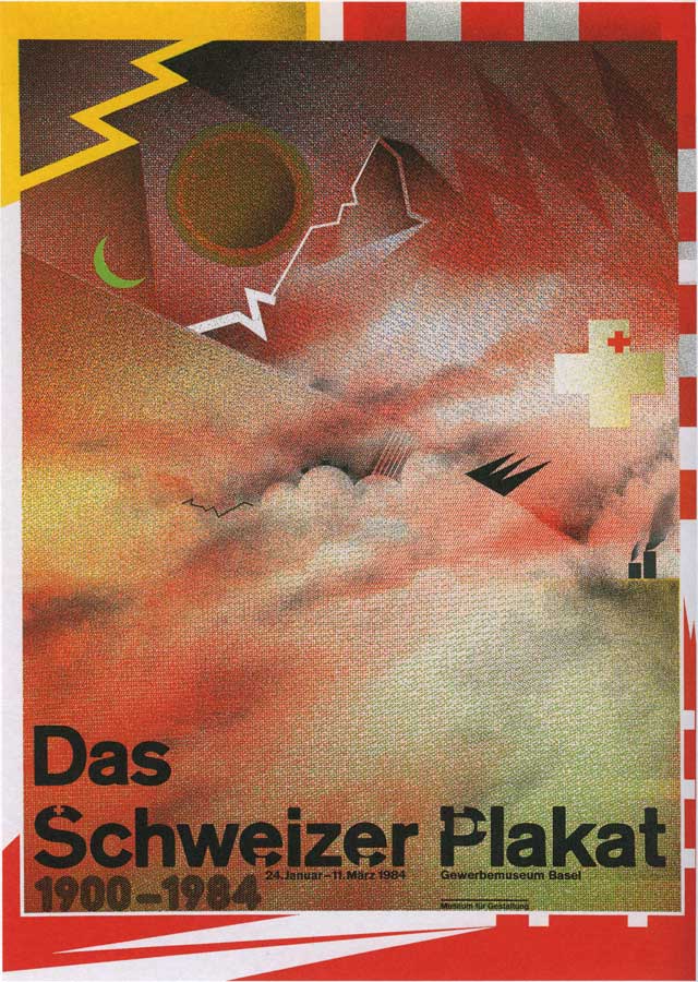
“The Swiss Poster 1900–1983” Worldformat poster (red version), film layering, 1983Client/publisher: Birkhaüser; Designer: Wolfgang Weingart.
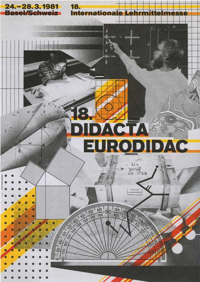
“18th Didacta/Eurodidac” Worldformat poster for the convention on teaching aids, film layering, 1980/81 Designer: Wolfgang Weingart.
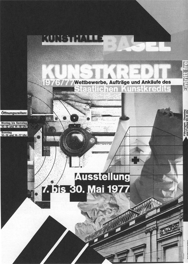
“Kunstkredit Basel 1976/77” Worldformat poster for Kunsthalle Basel, film layering, 1977 Designer: Wolfgang Weingart (First worldformat poster).
At the end of his three-year apprenticeship, Weingart had developed a keen sensitivity to the relationship between printing and the act of designing. Hanke encouraged him to attend the Basel School of Design, and Weingart travelled to the city in 1963, where he met with Hofmann and Ruder and applied to the school in person. The following year, he enrolled as an independent student.
It wasn’t until 1968 that Hofmann and Ruder realized their ultimate goal of creating an advanced graphic-design program for postgraduate professionals at the Basel School, in which a select group might engage in intensive multidisciplinary projects intended to further hone their skills and reenergize their intellectual engagement with design. In a bold move, Hofmann invited the 27-year-old Weingart, who was then virtually unknown, to conduct the typography class, as designers from all over the world flocked to the program.
Weingart felt right at home in the typeshop at the school—it served as his laboratory as well as his classroom, and it was in this space that he executed his magic. The experiments he had begun during his apprenticeship intensified. He used curved metal rules, creating circular compositions embedded in plaster. He experimented with interwoven geometric text composings influenced by ancient stone construction in the Middle East, where he had first travelled in the early 1960s. His classes themselves became workshops to test and expand models for a new typography.
“I was motivated to provoke this stodgy profession and to stretch the typeshop’s capabilities to the breaking point,” Weingart stated in the retrospective Weingart: Typography—My Way to Typography, published by Lars Müller in 2000. He went on to describe the experimental mood of the era: “Accelerated by the social unrest of our generation, the force behind Swiss Typography and its philosophy of reduction was losing its international hold. My students were inspired, we were on to something different, and we knew it.”
During his 37-year tenure, Weingart’s students included April Greiman, Jim Faris, Franz Werner, Robert Probst, Jerry Kuyper and Emily Murphy. The design process he employed was deceptively simple: students were first asked to consider the appropriate size, weight and style of the letters they wanted to use. They set the type by picking the lead letters individually from the type case and placing them side-by-side in a composing stick, carefully determining the proper letterspacing, end-of-line spacing and leading. The finished composing was printed in a letterpress proofing press and dried with baby powder. Students then cut it apart and began to design. In order to eliminate the shadows of the cut paper and see their compositions as one plane, a piece of glass was gingerly lowered over the surface. If anything didn’t feel right—type size, weight, style—the whole composing and printing process had to be repeated.
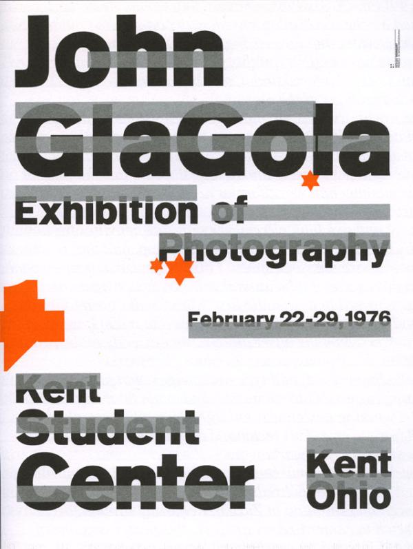
Untitled poster for a Kent State University student’s photography exhibition, 1975 Designer: Wolfgang Weingart.
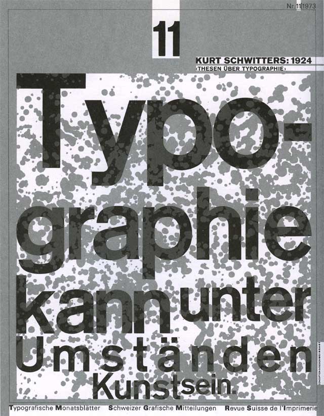
“Seeing, Reading, and Learning,” Number 11 from a series of 14 covers for TM, handset type, 1971 Designer: Wolfgang Weingart.
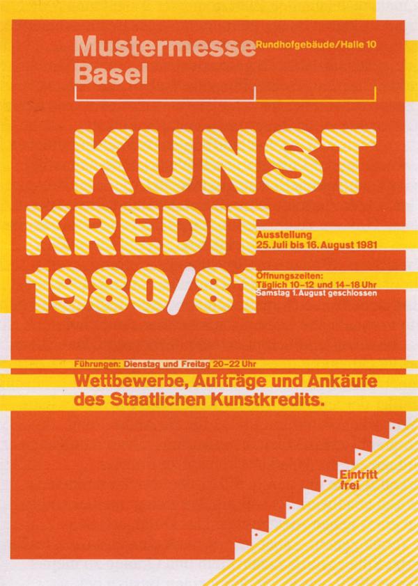
“Kunstkredit Basel 1980/81,” Worldformat poster for Kunsthalle Basel, 1981 Designer: Wolfgang Weingart.
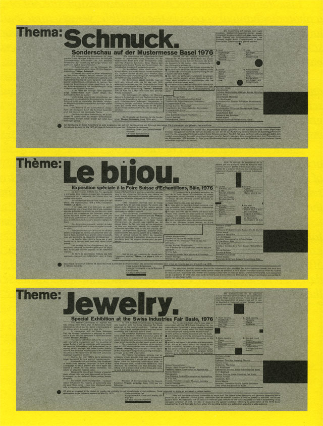
Poster for “Jewelry 1976,” a special exhibition at the Mustermesse Basel, 1975 Designer: Wolfgang Weingart.
“We were learning about order and systems and structure in his class,” recalls Terry Irwin, head of the School of Design at Carnegie Mellon University, who studied with Weingart from 1983 to 1986, “but he was not lecturing us about those things. That, I think, was the beauty of a Basel education.” Instead, students were encouraged to engage in a process of investigation. “You’d have multiple sketches laid out on your table, and you were trying something here, and then you were moving it around here,” she explains. “He would come around and tell you the impression it was giving, so you were trying to figure out what that meant. And you’d move it around a little more—probably still confused—and he’d come around and say, ‘Yes, better.’ And then he’d leave. And you’d be trying to figure out why it was better. But you came to understand ‘why’ yourself through these comments....It was an incredibly impactful way to learn.”
While teaching, Weingart continued to produce a formidable body of experimental work in his own right: posters as well as cover designs and call-for-entry designs for Typographische Monatsblätter magazine, where he served on the editorial board from 1970 to 1988. A 1976 poster he designed and printed for photographer John Glagola includes wide silver bars printed across the artist’s name, heralding the decline of foundry type as a viable commercial means of printing.
Weingart insistently sought new ways of creating images, adopting the halftone screens and benday films used in photomechanical processes as his new tools beginning in the mid-1970s. He used the repro camera to stretch, blur and cut type—a radical new approach for marrying continuous-tone images and letters. He would boast that his design process relied solely on these film manipulations and overlapping colors, seen perhaps most strikingly in his work for the Basel Kunstkredit—black-and-white world-format posters designed between 1976 and 1979 and a series of color posters made between 1980 and 1983.
Through his experimentations, Weingart was inventing his own visual language. As former teaching colleague Gregory Vines once wrote: “He pursues an idea until he is sure if it works or not. In the manner of Gutenberg, typesetter, printer and inventor Weingart realizes his publications or posters from beginning to end by himself. He chooses to be involved in the entire process, from the concept to preparation of the film montage for the printer....When looking through the copy camera or while developing film, new ideas and possibilities become evident, even mistakes trigger fascinating possibilities.”
Lloyd Miller, who studied with Weingart in the early 1980s, notes, “He is a master and pioneer in this field....Weingart’s working method was very much a precursor to the layering capabilities software programs [like Adobe Illustrator and Photoshop] would eventually offer.”
Still, Weingart never forgot his intensive training and experience in the intricacies of hand-setting type. He brought fascinating clarity and structure to dense, complex information found in the 1974 Creative Jewelry brochure and the 1980 catalog for Art Basel. Through his investigations, he even sought to capture the spontaneity and vigor of his own deliberately distorted handwriting as a form of typography, in posters announcing his 1990 retrospective exhibition at the Institute for New Technical Form in Darmstadt, Germany.
While working on the weekends in the typeshop at the school, Weingart often wheeled out a reel-to-reel tape player, and the music of German composers—Wagner, Beethoven, Mozart—would accompany his labor. One of his favorites was a recording of legendary orchestra conductor Bruno Walter rehearsing Mozart’s Linz Symphony in which Walter implores his musicians to share his grasp of a particular passage as “shimmering.” The same could describe Weingart’s body of work. His typographic vision embodies a similar vitality and richness. It shimmers.