2016 AIGA Medalist: Corita Kent
Recognition
2016 AIGA Medal
Born
1918, Fort Dodge, Iowa
Deceased
1986, Boston, Massachusetts
By Susan Dackerman
September 2, 2016
Follow Us
Recognized for her rebellious spirit as an artist and educator, and for her inventive use of graphic type and vibrant color in communicating messages of protest and social change.
When I first saw the way Corita Kent used language in her work, it reminded me of her famous pop art contemporaries Andy Warhol and Ed Ruscha. But while Kent depicted comparable subjects, employed similar visual strategies, and used the same vibrant color palette, she’s hardly, if ever, included in surveys of the ’60s art movement. Consequently, her work was unknown to me for many years, and I surmised that her obscurity was because she was a woman and, from 1936 to 1968, a nun.
An article in the June 28, 1966 edition of Look magazine stated, “Long before those young men in New York invented pop art, a small nun in Los Angeles was showing her students at Immaculate Heart College how to discover the novel and beautiful in popular magazines and packages from the supermarket. But Sister Mary Corita is a different kind of pop artist. Whereas the New York boys deal in a certain brittle archness (they are chic), Sister Corita and her students unabashedly affirm and celebrate the here-and-now glories of God’s world—the words of Beatles’ songs, the pictures on cereal boxes, the sheen of stamps, the typography in movie magazines.”
Kent was often asked to explain why she chose to forgo figurative imagery and rely solely on words. “I think a picture with all words is as much a picture as something with abstract or recognizable shapes,” she said in a 1976 interview. Three years later, she echoed that sentiment. “I really love the look of letters—the letters themselves become a kind of subject matter even apart from their meaning—like apples or oranges are for artists.”
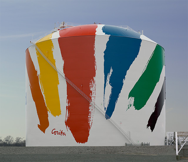
Corita Kent, “Boston Gas Tank” (Rainbow Tank), 1971. Paint on steel and aluminum. Property of National Grid, Dorchester, Massachusetts. © National Grid. Photo: © President and Fellows of Harvard College.
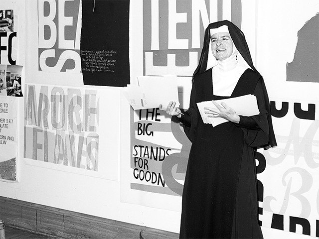
Kent at Immaculate Heart College, Los Angeles, 1964. Courtesy of Corita Art Center.
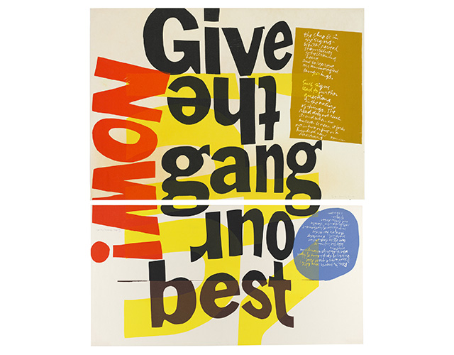
Corita Kent, “(give the gang) the clue is in the signs,” 1966 and “(our best) reality proves very little,” 1966. Screenprints. Harvard Art Museums/Fogg Museum, Margaret Fisher Fund, 2008.157, 2008.158. © Corita Art Center, Immaculate Heart Community, Los Angeles. Photo © President and Fellows of Harvard College.
From even the most cursory glance at her screen prints, it’s clear Kent loved playing with well-designed letterforms, but she also found special meaning in the words. In 1966, she transformed Canada Dry’s slogan, “Give the gang our best,” into an affirmative call to action to give to others the best of oneself. She changed the look of the catchphrase. Instead of presenting it as it appears in the advertisement, she stacked the words and turned two of them upside down. An emphatic “NOW!” on the left balances the mustard rectangle and blue circle on the other side, and the yellow words, “Turn, Turn,” provide an underlying architecture to the composition.
In many printed designs just like this, Kent reconfigured assorted visual information to deliver messages of hope and salvation. She found these words and sayings in the most ordinary places: the pages of popular magazines; ads for soda, tomato sauce, and potato chips; and street signs that declared “STOP” and “WRONG WAY.”
Kent lived an extraordinary life. As a young child, she moved with her family to Los Angeles. When she was 18, she entered the Roman Catholic order of the Sisters of the Immaculate Heart of Mary in Hollywood, where she lived, studied, and taught art. In her lifetime, she made nearly 700 screen prints, undertook public art commissions, worked on ad campaigns, wrote and designed books, produced films, orchestrated happenings, and created a mural for the Vatican Pavilion at the 1964–65 New York World’s Fair.
In 1966, she was one of the Los Angeles Times’ “Women of the Year;” the following year, she was featured on the cover of Newsweek as the model of “the modern nun,” and was profiled in “100 American Women of Accomplishment” in Harper’s Bazaar. Then in 1968, for reasons she never fully articulated, Kent left not only her teaching position at Immaculate Heart College but the order, Catholicism, and all forms of organized religion. She moved to Boston, where she continued to make prints and create a wide range of graphic design work.
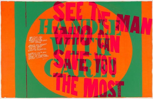
Corita Kent, “handle with care,” 1967. Screenprint. Harvard Art Museums/Fogg Museum, Margaret Fisher Fund, 2012.186. © Corita Art Center, Immaculate Heart Community, Los Angeles. Photo © President and Fellows of Harvard College.
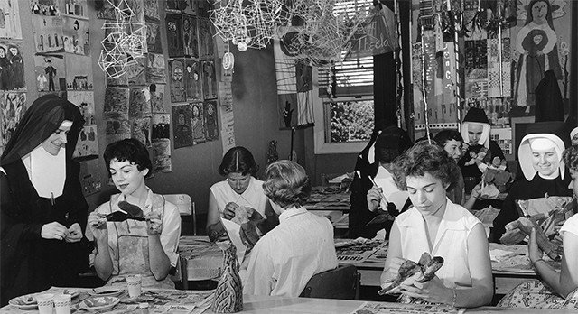
Kent with students at Immaculate Heart College, Los Angeles, 1955. Courtesy of Corita Art Center/Tang Museum.
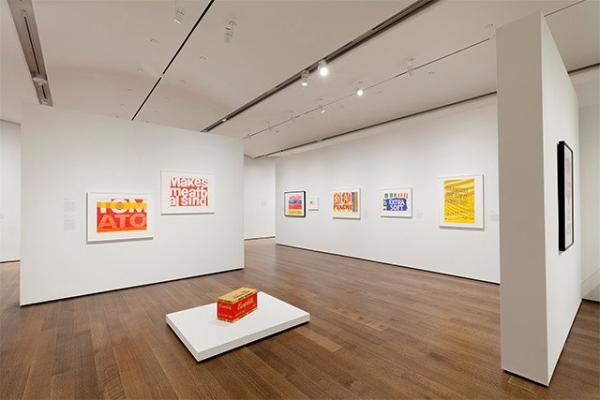
Installation shot of “Corita Kent and the Language of Pop,” with Canada Dry print, on display September 3, 2015 through January 3, 2016 at the Harvard Art Museums. Thematic gallery: Salvation at the Supermarket. Photo: © President and Fellows of Harvard College.
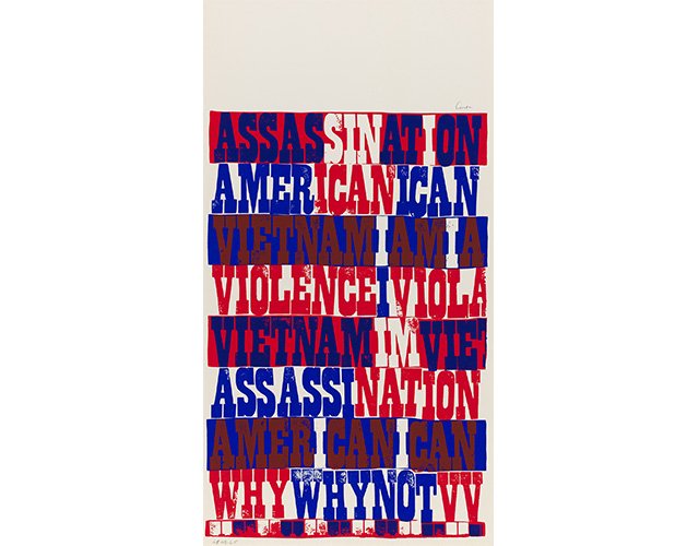
Corita Kent, “american sampler,” 1969. Screenprint. Harvard Art Museums/Fogg Museum, Margaret Fisher Fund, 2008.194. © Corita Art Center, Immaculate Heart Community, Los Angeles. Photo © President and Fellows of Harvard College.
In 1971, the Boston Gas Company commissioned her to create the colorful design that decorates its 150-foot-high liquid natural gas holding tank. Now a Boston landmark, the tank still sits alongside the interstate south of the city, allowing thousands of visitors and commuters to encounter her monumental artwork every day. Kent is perhaps best known for the “LOVE” stamp she created for the United States Postal Service in 1985, which uses the same rainbow stripes as the gas tank. Like her screen prints, these public works openly communicate her celebration of life.
But Kent also used artful words to communicate her condemnation of the deplorable aspects of the world, namely the Vietnam War, poverty, hunger, oppression of African Americans, and bias within the Catholic Church. Describing the political activism of her artwork, she said, “the idea of using words with visual forms and using just short passages is often a way to help awaken people to something they may not be aware of, rather than enclosing it in a book or making a speech about it.”
Unlike many of her contemporaries, Kent did not march or attend protests, but instead created screen prints that clearly articulated her views. Phrases such as “Stop the bombing,” “Make love not war,” and “Why not give a damn about your fellow man” fill her carefully composed printed work. What’s so remarkable about that work is how relevant it remains today. Her 1969 “American Sampler,” a jumble of red, white, and blue words spelling “AMERICAN,” “ASSASSINATION,” “VIOLENCE,” and “WHY” is not only visually compelling, it is timeless. If not for her inclusion of the word “VIETNAM,” we might think she was referencing Iraq, Afghanistan, Ferguson, Missouri, or other places that consume the contemporary political imagination.
Now, as Kent’s life and work becomes better known, we should remember that her oeuvre is not just graphically intelligent and innovative, it is also laden with meaning. It was created to inspire us to act for the common good, to help those around us, to resist greed and other selfish impulses, and to be part of a beneficent world community. That is the message that Kent continues to offer us in her vibrantly colored, brilliantly designed work.