
Recognition
2017 AIGA Medal
Born
1937, Newark, New Jersey
By James Gaddy
September 20, 2017
Follow Us
Recognized for his mastery of visual ecosystems and for setting the standard for the universal, public design experience.
“Out in the street” is more than a mantra for Lance Wyman. It’s an organizing principle that has driven him ride alongside beat cops in downtown Detroit, discussing the finer points of crowd management with museum security guards in Washington D.C., and interviewing bartenders in Mexico City—all in an effort to illustrate a specific place through design. His designs for metro stations, zoos, museums, and international sporting events have established him as a model public designer. “Lance has nearly always worked for a mass audience, yet has not had to dumb down his design,” said Adrian Shaughnessy, one of the editors of a monograph on Wyman’s work published in 2015. “That is some achievement.”
Born on July 2, 1937 in Newark, New Jersey, Wyman grew up in nearby Kearny, a traditionally Scottish neighborhood. He learned how to tell stories from his grandfather, and his mother encouraged him to draw.
Following a tip from a friend of his father, he went to study industrial design at Pratt Institute in Brooklyn. While there, he became interested in designing an image that could communicate an idea in a systematic and spatial way: a universal, visual language. His first experience of this sort was designing graphics for the American Pavilion at the 1962 Zagreb International Trade Fair in Croatia. Then in 1964 he worked with George Nelson on the Chrysler Pavilion for the World’s Fair in Queens, New York. There the objective was to educate children about the automotive industry, and in the course of designing safety posters, Wyman created a series of whimsical pictograms that would later be widely used in factories across the United States.
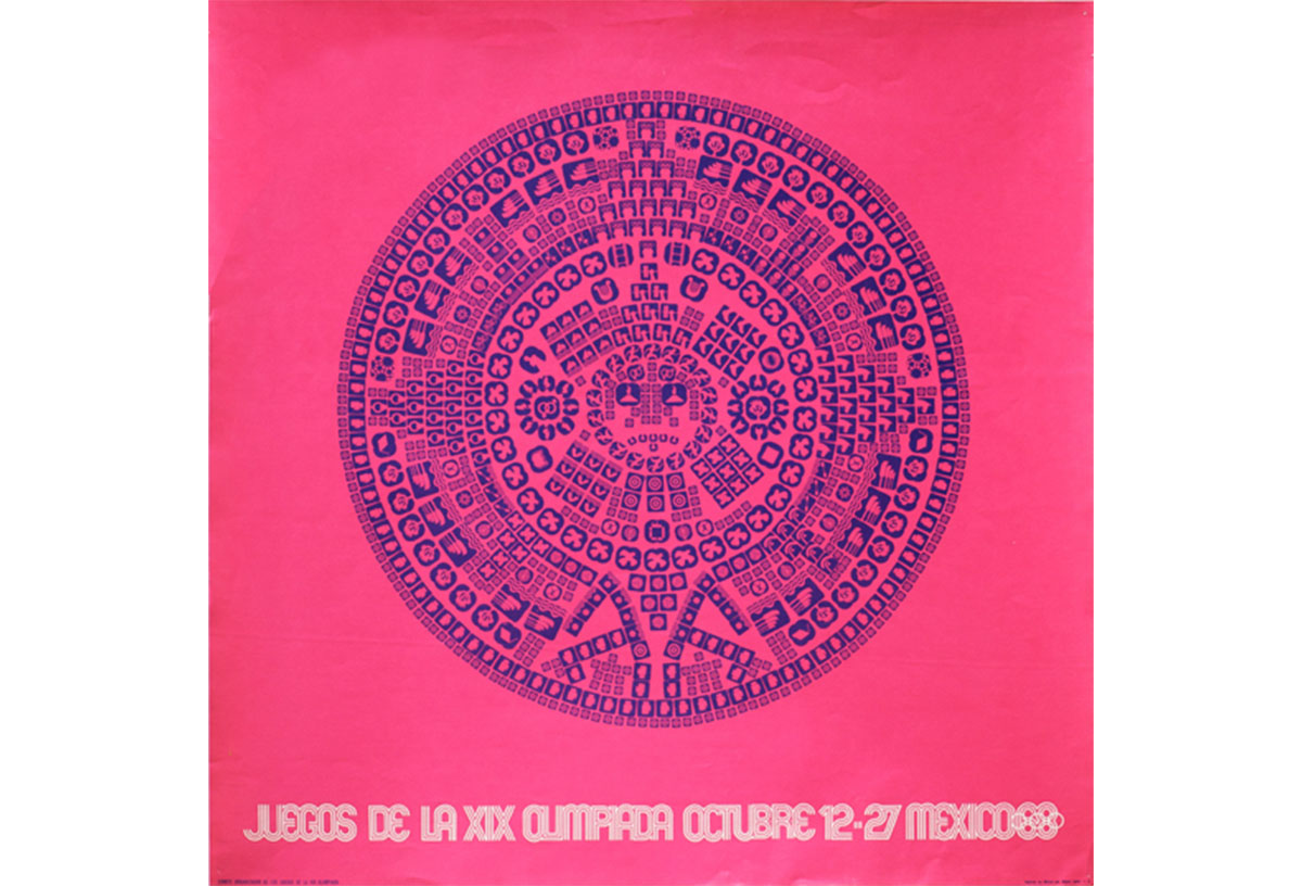
“Mexico68,” 1968: Poster displaying the dates of the 1968 Olympic Games in Mexico City. Designed with Jan Stornfelt, an image of the Aztec calendar is constructed using the icons of the sporting and cultural events.
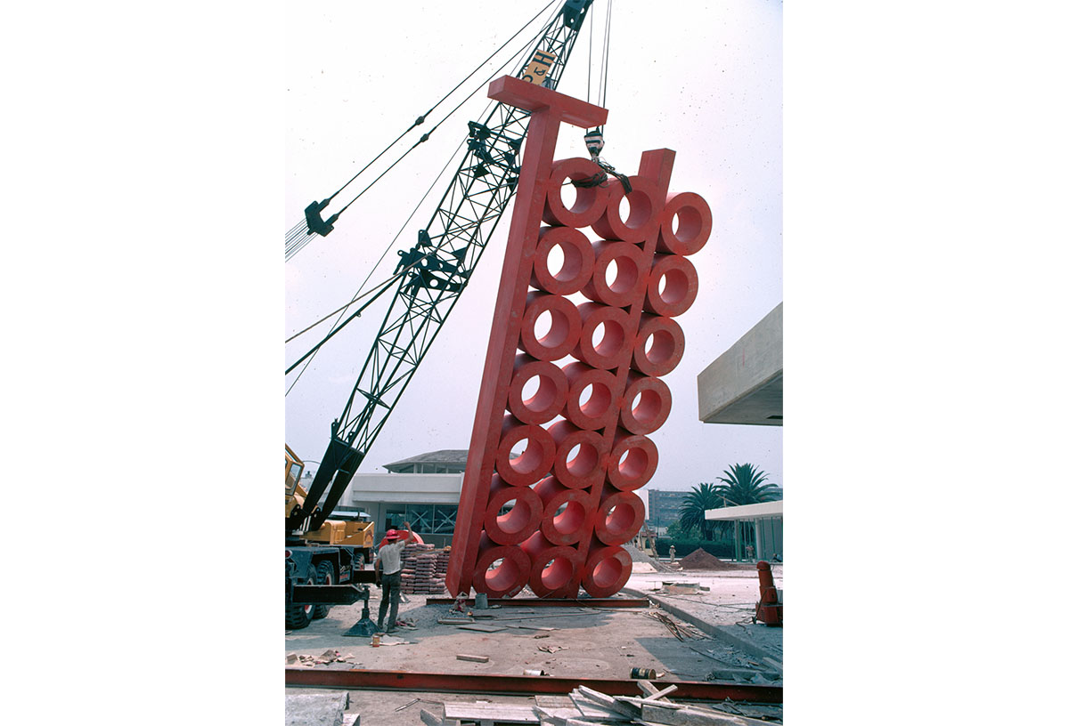
deTodo Shopping Mall, 1969: Installation of the logo for deTodo, a shopping mall in Mexico City. The 35-foot-tall steel version of the logo sat in front of the shopping complex and is an homage to Mathias Goeritz, the architect of the project.
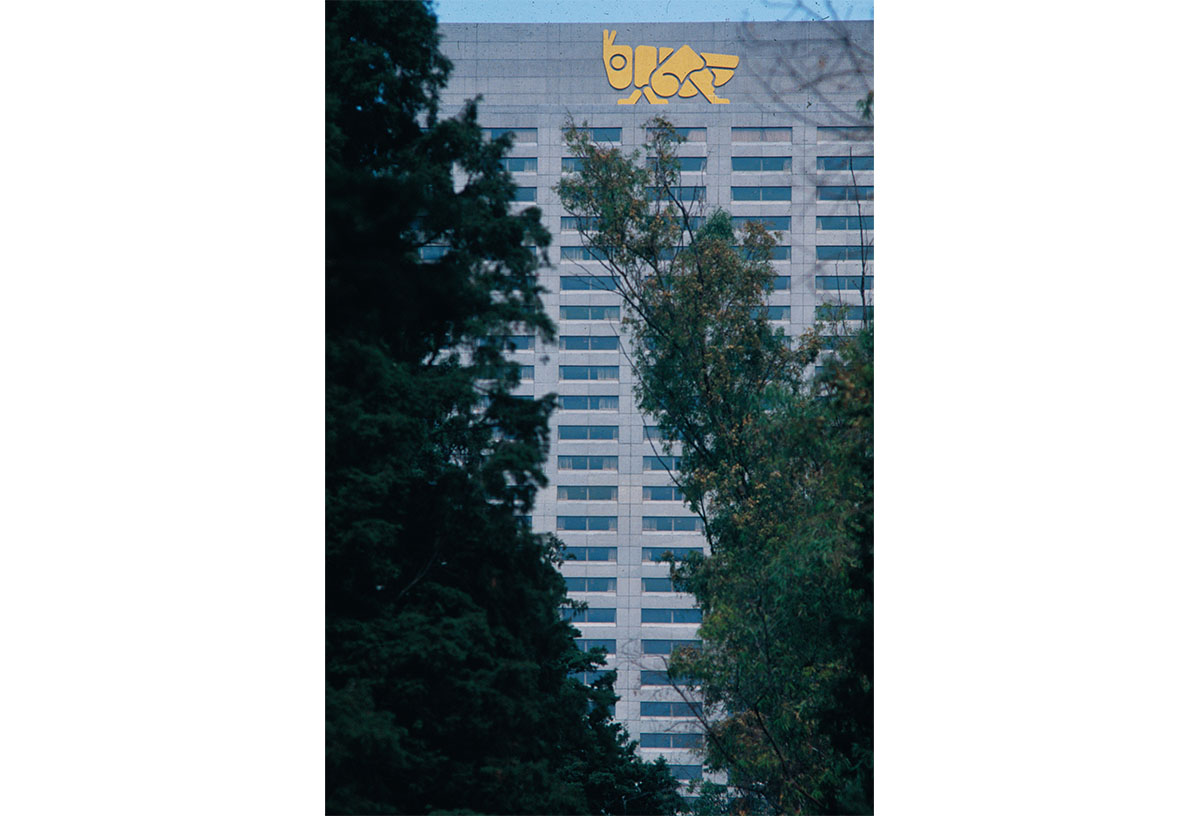
El Presidente Chapultepec Hotel, 1975: Exterior signage for the El Presidente Hotel in Mexico City.
Wyman’s ability to condense information into precise and easily understood motifs found its purest essence in Mexico City, which inspired his logos for the Camino Real Hotel, the Mexico City Metro, and the 1970 World Cup. When he traveled there to pitch a system of graphics for the 1968 Olympics, he bought a one-way ticket and spent his first week inside the Museum of Anthropology, soaking in the pre-Columbian cultures of the Aztecs and Mayans. “I had no idea about Mexico,” he says. “All I knew was that they had piñatas.”
His eventual design—weaving in Op Art abstraction and vibrating colors with geometric forms of Mexican folk art—ended up being reproduced not just on brochures but on the sides of buildings, uniforms, stamps, public installations, and homemade signs. The logo elegantly combined the numbers six and eight with the game’s signature rings in a way that referenced the country’s visual history without appropriating or patronizing local culture. His sophisticated icons served as a common visual language for an audience who, largely, was not fluent in Spanish.
The identity for the XIX Olympic Games has become the prototype for how designers can respond to a particular time and place in a public and accessible way. In Meggs’ History of Graphic Design, Philip B. Meggs calls the design for the games “one of the most successful in the evolution of visual identification.”
Wyman’s design for the Mexico City Metro refined his approach further. Each station is identified by a meaningful icon—a visual mnemonic—that draws on an anecdote from history, an existing monument in the area, or an important function related to that neighborhood. He came up with the image of the grasshopper for Chapultepec station because in the Aztec language, Chapultepec means “grasshopper hill.” For Candelaria, an area inhabited by criminals known as “ducks” in the local slang, the station logo depicts a swimming duck. His emphasis on pictograms would influence the designers of the smartphone and the app store 40 years later.
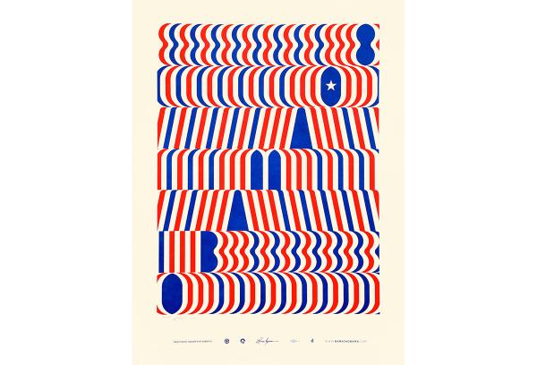
“Obama ’08,” 2008: An official poster for Barack Obama’s 2008 presidential campaign.
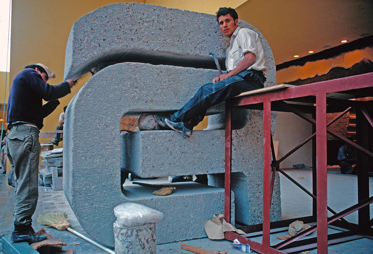
Camino Real Hotels, 1967: Installation of the logo for the Camino Real Hotel, Mexico City.
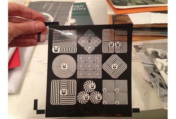
Cultural Olympiad, 1968: A range of printed items promoting Cultural Olympiad events, featuring cultural symbols designed by Wyman, Beatrice Cole, and José Luis Ortiz.
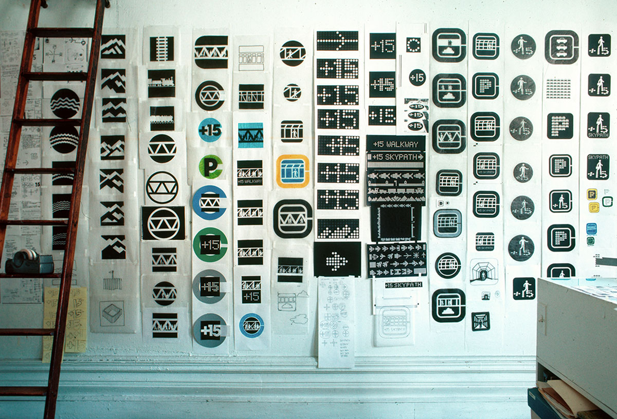
Calgary +15 Skywalk System, 1985: Sketches for the Calgary +15 Skywalk logo on the wall in Wyman's studio.
Wyman has rarely missed an opportunity to use an animal motif in his icons, whether he’s integrating birds into the directionals for the National Zoo in Washington, D.C., whales into the wayfinding at the American Museum of Natural History, or the famous moose of the logo for the Minnesota Zoo. “Lance proves that graphic design can be beautiful, possess huge integrity and rigor, and be utterly joyful,” says Tony Brook, an editor on Wyman’s monograph. “What a rare gift that is.”
It’s a legacy that spans some of the most trafficked cities and streets in America. One of Wyman’s longest-lasting designs is the mapping system, system diagram, and neighborhood maps for the Washington D.C. Metro. The project, created with partner Bill Cannan, spanned from 1971 until the metro opened in 1976, and was then updated in 2011. The system affects approximately 260 million people who ride the D.C. Metro every year, including tourists from every part of the world. The station icons depict landmarks such as the Washington Monument, White House, and Lincoln Memorial, and a system map comprised of six bold lines was inspired by the map of the London Underground.
Today Wyman still works out of a small studio on the Upper West Side, where he and his wife, Neila, have lived since 1971. He spent 40 years at Parsons teaching the next generations of students, and he has always worked with small teams, preferring to remain close to actual design work—“a far cry from the amalgam of managing/pitching/growing/selling responsibilities that mark many of today’s successful creative-class leaders,” wrote Jan Wilker, cofounder of the design studio karlssonwilker.
Spanning cities all over the globe, Wyman has leveraged his unique ability to transform two-dimensional marks into a visual language that can communicate in a three-dimensional real world. This ability to help people move freely from place to place is what—more than anything—will remain his greatest contribution. “I just wanted to make something that wouldn’t disappear.”
-
1937 Born in Newark, New Jersey
-
1960 Graduates from Pratt Institute
-
1960 Moves to Detroit to design packaging for Delco Electronics
-
1962 First taste of spatial graphics at Zagreb International Trade Fair
-
1964 Designs branding, signs, and safety posters for Chrysler Pavilion at World’s Fair in Queens, New York
-
1968 Designs logo, icons, and signs for Mexico City Olympics
-
1969 Designs logo, icons, and wayfinding for Mexico City Metro
-
1971 Moves back to NYC and forms Wyman & Cannan in partnership with Bill Cannan
-
1975 Designs signage for National Zoo, Washington, D.C.
-
1976 Completes maps, system diagram, and neighborhood maps for Washington, D.C. Metro
-
1979 Forms Lance Wyman Ltd.; completes graphics for Minnesota Zoo
-
1990 Redesigns logo and signage for American Museum of Natural History
-
1999 Designs icons and wayfinding for City of Detroit
-
2007 Designs branding and wayfinding for City of Santa Fe
-
2015 Lance Wyman: The Monograph published by Unit Editions
- 2017 Lance Wyman the Visual Diaries 1973–1982 published by Unit Editions
Sources
Shaughnessy, Adrian. Lance Wyman: The Monograph [Unit 20]. London: Unit Editions, 2000.
Solin, Arthur. “Mexico 68: Graphics for the XIX Olympiad.” Print, May/June 1968.