
Recognition
2018 AIGA Medal
Born
1954, Ithaca, New York
By Zachary Crockett
September 17, 2018
Follow Us
Recognized for her bold and intelligent design of icons for the early Macintosh computers that defined the Apple user experience and set the industry standard with memorable wit and humanity.
No great technological revolution can succeed without an artistic sleight of hand. Susan Kare, known as the “woman who gave the Macintosh a smile,” has spent her three-decade career at the apex of human-machine interaction. Through her intuitive, whimsical iconography, she made the graphic user interface accessible to the masses, and ushered in a new generation of pixel art.
In the early 1980s, Kare—then a sculptor and tech-world outsider—pivoted to a graphic designer role at Apple. There, she created some of the most recognizable icons, typefaces, and graphic elements in personal computing: the command symbol (⌘), the system-failure bomb, the paintbrush, and, of course, “Clarus the Dogcow.” With little more than a few dots on a screen, Kare created a canvas of approachable visual metaphors that are instantly recognizable decades later.
Early on, Kare found a sanctum in fine art. After earning a Ph.D. from New York University, she went westward to take a curatorial job at the Fine Arts Museums of San Francisco. She soon migrated down to Palo Alto—the birthplace of Apple and other Silicon Valley giants.
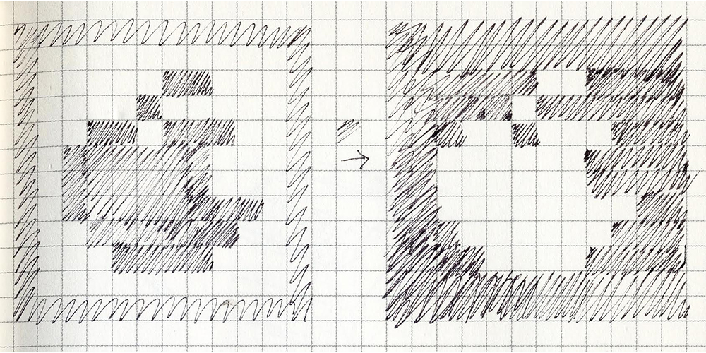
Sketches of the early Apple logo icon, courtesy of Susan Kare.

Happy Mac, designed in the 1980s, is the boot-up icon of Apple Macintosh computers with older versions of the Mac operating system. Image courtesy of Susan Kare.
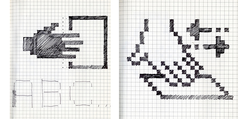
Icons designed in 1982 for an interview at Apple, courtesy of Susan Kare.
In 1982, Kare received a call from Andy Hertzfeld, a high school friend whom she’s known since age 14. Hertzfeld, then one of the early members of the Macintosh team at Apple, was looking for a designer and had Kare in mind. An artist at heart, she was working on a welded sculpture of a life-size razorback hog as a commission for a museum in Hot Springs, Arkansas at the time. “My ideal life would be to make art full-time. I had the chance to do that with this commission,” Kare said in an interview with Stanford University in 2000. “I really enjoyed making this sculpture; but it was kind of solitary, so it was interesting for me to segue from that to working at Apple.”
Once at Apple, Kare was entrusted with a daunting task: to use iconographies to make the Macintosh feel less like a machine and more like an easy-to-use, relatable workstation. As the first low-cost personal computer for nontechnical consumers, it was imperative that the Macintosh icons be universally inviting and intuitive. Since Kare had scant experience designing in the digital realm, she drew from her experience with mosaics, needlepoint, and pointillism. After procuring “the smallest graph paper” she could find in an art supply store, Kare drew out a 32-by-32 grid. Each of the 1,024 squares represented a pixel, mimicking the bit-mapped display of the early Apple interface. She proceeded to hand-sketch many of the early Apple icons, pixel by pixel.
Each sketch began with a computer function, like “boot” or “debug.” Utilizing an eclectic pool of sources ranging from pirate lore to ancient hieroglyphics, Kare then conceptualized the jargon into a digestible visual metaphor. The command symbol, for instance, was conceived when Kare pored through old symbology books for hours and saw the Saint Hannes cross, an ancient symbol also used by Scandinavians in the 1960s to mark locations of cultural interest.

A selection of logos, designed for clients, courtesy of Susan Kare.
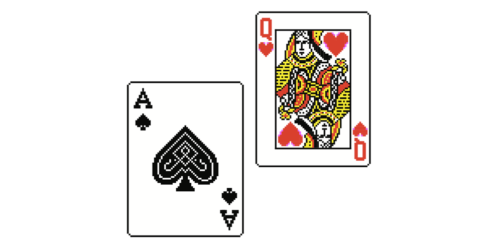
Solitaire cards designed for Microsoft, courtesy of Susan Kare.
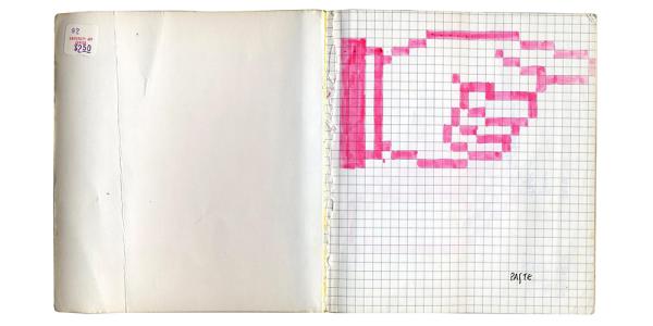
Pointing hand, designed in 1982 for an interview at Apple. Image courtesy of Susan Kare.
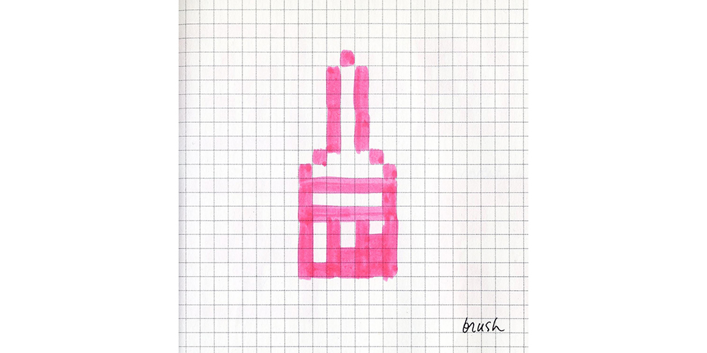
Paintbrush, designed in 1982 is similar to the brush icon designed for Bill Atkinson’s Macintosh MacPaint program. Image courtesy of Susan Kare.
Kare also pioneered the first proportionally spaced digital font family. Operating under the constraint of only 9-by-7 dots per letter, Kare was able to avoid the jagged, pixelated look of monospaced computer typefaces by enlisting only horizontal, vertical, or 45-degree lines. One resulting typeface, Chicago, was used on the Macintosh and iPod for more than two decades.
Through all of her challenges, Kare always operated with a whimsical charm and an independent streak. She once festooned Apple’s office with a pirate flag, complete with a signature rainbow-colored eye patch, an ode to the team’s infamous motivational quote: “It’s better to be a pirate than join the navy.” And no colleague—not even Steve Jobs himself—was safe from being rendered in pixel art form by Kare. And then there was “Clarus the Dogcow,” an ambiguous-looking animal icon Kare designed as a part of Apple’s Cairo font. Clarus gained such a cult following that Kare still produces prints of the icon for its many fans.
In 1988, Kare launched her own firm, Susan Kare Design, which she maintains today. In the ensuing decades, she has successfully adapted to the ever-shifting tides of technology. Between 2006 and 2010, she designed hundreds of virtual gifts for Facebook—a brilliant, full-color suite of cupcakes, penguins, and rubber duckies that departed from the two-dimensional pixel art she’d designed at Apple.
Today, Kare continues to sell her prints on kareprints.com, and works as a creative director at Pinterest, where she focuses on adding meaning and clarity to the platform’s feed. Her iconography has been featured at the National Museum of American History, MoMA, SFMOMA, and the New Mexico Museum of Natural History and Science in Albuquerque. She’s done design work for more than 50 major clients, including Microsoft, Intel, IBM, Motorola, and Sony Pictures.
But throughout the years, Kare has strictly adhered to a design philosophy that rests on the tenets of simplicity, clarity, and beauty. And though she’s upgraded her tools from graph paper to design software, Kare continues to place a premium on context and metaphor. On the streets of San Francisco, she intrepidly hunts for catchy symbols and shapes; once inspiration strikes, she works within a grid-like template in Adobe Illustrator—a tool to help her visualize the constraints of the device on which her user will view her icons. Each icon, she contends, must not only be easy to understand, but easy to remember.
In the digital era, where visual pollution clogs the Web, her simplicity-driven philosophy enjoys a heightened relevance. Now an icon in her own right, Kare does too.
Sources
Crockett, Zachary. “The Woman Behind Apple’s First Icons.” Priceonomics, April 3, 2014. https://priceonomics.com/the-woman-behind-apples-first-icons/
Hintz, Eric S. “Susan Kare: Design Icon.” SIGCIS. October 11, 2015. https://www.sigcis.org/files/Hintz.pdf
Kare, Susan. “Susan Kare: Limited Edition Prints, Signed & Numbered.” Susan Kare, 2010. http://kareprints.com/
Orin, Andy. “I’m Susan Kare, Graphic Designer, and This Is How I Work.” Lifehacker, October 15, 2014. https://lifehacker.com/im-susan-kare-graphic-designer-and-this-is-how-i-work-1646211826
Pang, Alex. “Interview with Susan Kare.” Stanford University, September 8, 2000. http://web.stanford.edu/dept/SUL/library/mac/primary/interviews/kare/trans.html
Levy, Steven. “The Birth of the Mac: Rolling Stone's 1984 Feature on Steve Jobs and his Whiz Kids.” Rolling Stone, October 6, 2011. https://www.rollingstone.com/music/news/the-birth-of-the-mac-rolling-stones-1984-feature-on-steve-jobs-and-his-whiz-kids-20111006
Silberman, Steve. “Updated: The Sketchbook of Susan Kare, the Artist Who Gave Computing a Human Face.” PLOS. February 18, 2015. Accessed February 20, 2018. http://blogs.plos.org/neurotribes/2015/02/18/updated-sketchbook-susan-kare-artist-gave-computing-human-face/
Brownlee, John. “Q&A: Susan Kare On Why Pinterest Feels Like Apple in the ‘80s.” Fast Company. August 19, 2015. Accessed March 2, 2018. https://www.fastcodesign.com/3050038/qa-susan-kare-on-why-pinterest-feels-like-apple-in-the-80s